How I Built a CRM Dashboard for International Patient Operations
Our CRM held the records, but it did not provide the operational view we needed. I built KCD Dashboard to connect inquiry quality, funnel movement, consultant performance and estimated marketing return in one reporting layer.
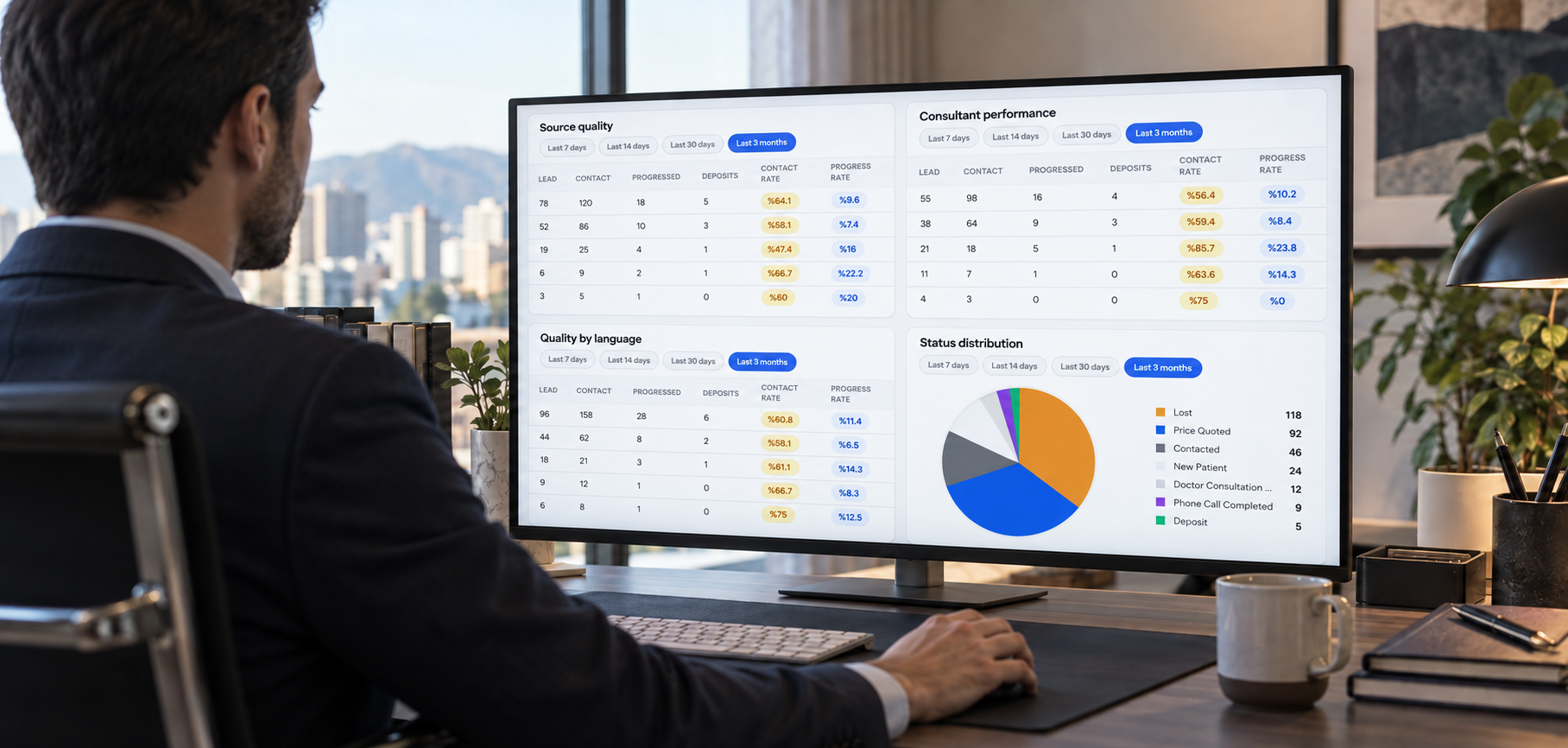
Our CRM held the records, but it did not provide the operational view we needed. I built Versatile Dashboard to connect inquiry quality, funnel movement, consultant performance and estimated marketing return in one reporting layer.
Why I built it, how I defined the metrics, what the dashboard shows, and where it still has limits
A CRM report can be technically correct and still answer the wrong operational question.
Our CRM already contained the patient records, sources, consultants and current statuses. But when management needed to understand what was actually happening, the answer usually required several screens, exported files and a separate calculation.
How many real inquiries did we receive?
Which sources produced meaningful progress rather than volume?
Where did patients leave the process?
How did consultant performance change?
Was advertising spend creating an estimated return?
The information existed, but the operational picture did not.
That gap is why I built Versatile Dashboard.
I independently designed, built and deployed it as a private reporting layer for international patient operations, and I continue to operate it. It does not replace the CRM. It turns the data already inside it into questions the operation can actually use.
One point up front: this is not a universal healthcare reporting product. It was built around the requirements, terminology and workflow of one international patient operation. The principles can travel, but the definitions should be tested against each organisation’s own process.
The first problem was not technical
The first version could not begin with charts. It had to begin with definitions.
The word “inquiry” sounds simple until the same patient can enter the CRM as a Lead, later become a Contact, or arrive directly as a Contact without passing through the Lead module.
Counting only Leads misses part of the operation. Adding every Lead and Contact without accounting for conversion can count the same patient twice.
Versatile Dashboard treats an inquiry as part of a combined Lead and Contact model, with rules for direct Contacts and converted Leads. The purpose is not to create the largest possible number. It is to create a number that represents the business process consistently.
The reporting date created a similar problem.
A record’s creation or modification timestamp tells you when something happened inside the CRM. It does not necessarily tell you when the patient applied.
For period reporting, the dashboard uses the actual application date. Records without that date are excluded from the main period metrics and shown separately as a data quality issue.
That distinction matters. Otherwise, an old patient record edited today can appear as a new inquiry, while a genuine application can fall into the wrong reporting period.
The difficult part was not drawing the charts. It was deciding what each number should actually mean.
What Versatile Dashboard is
The CRM used in this operation is Zoho CRM.
I built Versatile Dashboard as a separate application around its Leads and Contacts data. It brings the records into one reporting model and analyses them by source, consultant, language, country, status and application period.
The interface is divided according to the question being asked.
The overview provides a compact management summary for recent periods.
The detailed analysis focuses on the funnel, consultant performance and real status movements.
The reports section produces date, source and language based summaries for Google and Meta advertising activity, including copyable text and printable output.
Keeping these views separate was intentional. A management summary becomes less useful when every operational table is placed inside it. An agency report becomes harder to read when it is mixed with internal consultant analysis.
More information is not always a better dashboard. The information needs to appear in the context where someone can act on it.
A status shows the present, not the journey
A current CRM status answers one question: where is this patient now?
It does not show how the patient arrived there.
A patient currently marked as a lost inquiry may have moved through a consultation, received a quote and remained active for several days before leaving. Another patient with the same final status may never have replied to the first message.
The final status is identical. The operational stories are not.
To see that difference, Versatile Dashboard uses real status history from the Zoho CRM Timeline API. It reads changes to the relevant Lead and Contact status fields and turns them into chronological events.
Those events are then classified according to the actual funnel.
Moving from a new inquiry to a phone or doctor consultation is meaningful progress. Reaching hot sales or deposit is a stronger movement. Falling into lost, irrelevant or unreachable outcomes is a regression.
Not every update belongs in the positive panel. Sending a WhatsApp message may be a normal process step, but it is not equal to receiving a deposit. Completing treatment may matter in general reporting, but it should not be used to make a process progression panel look more positive.
The classification is deliberately selective. A timeline is only useful when routine activity does not hide the movements that management needs to see.
Most importantly, the dashboard does not invent missing history. If the Timeline API cannot provide an event, the system should report that limitation rather than reconstructing a story from the current status.
Lead volume is not marketing performance
Advertising reports often stop at the easiest available number: how many leads came from each platform.
That number is useful, but incomplete.
A source can produce a high number of inquiries and very little progress. Another can produce fewer inquiries but more consultations, hot sales or deposits. Treating both sources according to volume alone hides the part of the funnel that actually matters.
Versatile Dashboard connects advertising spend with CRM outcomes.
The KPI section calculates measures such as cost per inquiry, cost per meaningful contact and acquisition cost at later funnel stages. Results can be segmented by source, language and country.
It can also calculate estimated ROAS and ROI when an average revenue assumption is provided.
The word “estimated” matters here.
The dashboard does not treat an assumed average revenue as confirmed accounting income. The calculation is a management scenario based on the spend, observed CRM outcomes and revenue assumptions entered into the system.
Keeping the assumption visible makes the number more useful. It also prevents an estimate from being repeated later as if it were a financial result.
CRM outcomes do not explain everything
CRM data can show that an inquiry did not progress. It rarely explains why.
Was the patient’s budget unsuitable?
Was the treatment date too far away?
Was there a language barrier?
Was the patient comparing several clinics?
Did the consultant believe the lead quality had changed that week?
To capture that side of the operation, I added separate consultant survey rounds to Versatile Dashboard.
Consultants can evaluate Google and Meta inquiry quality, record the difficulties they experienced and describe market-specific problems. When multiple countries are selected, each country keeps its own reasons instead of receiving one shared explanation.
The survey results can then be compared with the CRM outcomes already loaded into the dashboard.
This does not turn consultant opinion into objective fact. It places perception next to recorded performance.
That difference is important. If consultants describe a week as weak and the CRM funnel shows the same decline, the two signals support each other. If the perception and the data disagree, that disagreement is itself worth investigating.
The survey is not there to replace the numbers. It helps identify the questions the numbers cannot answer alone.
Building for an actual operating environment
A dashboard connected to a CRM has to work within technical and operational limits.
Refreshing every screen directly from the CRM API would create unnecessary requests and make the reporting experience depend on an external service every time someone opened a page.
Versatile Dashboard therefore uses a controlled cache. The application refreshes data according to its own process, keeps a persistent local copy and preserves the last usable dataset when the CRM is temporarily unavailable.
This is not only a performance decision. It is an operational continuity decision.
The system is private and protected by authentication. Reporting endpoints are not intended for public access, and user activity can be recorded in an audit log.
I also added a presentation privacy mode.
When enabled by the authorised user, patient names and survey fields that may contain a patient name or CRM identifier are masked across the relevant views.
The original CRM, survey and cache data are not changed. The protection exists only in the display layer and can be reversed after the presentation.
This does not turn a screenshot into a compliance certificate. It solves a narrower problem: allowing operational analytics to be presented without exposing patient identities on screen.
What changed
The first change was not a sudden increase in a single KPI.
It was consistency.
An inquiry, a reporting period and a conversion now have defined meanings inside the reporting system. The same question no longer needs to be recalculated differently for each report.
Marketing conversations can continue beyond lead volume. Source performance can be examined through consultation, hot sales and deposit movement.
Consultant performance can be read alongside the cases assigned to them, the stages those cases reached and the feedback consultants provided from the field.
Agency reports can use the same CRM definitions as internal management reports.
The dashboard also makes data quality problems visible. A missing application date or consultant assignment does not disappear inside a total. It appears as something that needs to be corrected.
The value is not that every decision becomes automatic. The value is that the decision begins with a shared version of the operation.
What the dashboard does not solve
The system still depends on the quality of the data entered into the CRM.
If an application date is missing, the dashboard does not guess it. If a source is recorded incorrectly, the report will carry that mistake. If consultants use statuses inconsistently, the funnel will reflect that inconsistency.
The KPI calculations also have a ceiling. Estimated marketing return depends on the revenue assumptions provided. It is not a replacement for accounting data or treatment-level profitability analysis.
Consultant surveys add context, but they remain subjective. They should be compared with CRM outcomes, not used as a substitute for them.
The dashboard is also not a medical record system. It is an operational reporting layer built around inquiry, marketing and consultant workflows.
Finally, the structure is specific to this operation. Another clinic may define progress differently, use different status stages or require a different separation between Lead and Contact records.
Copying the interface would be easy. Copying the definitions without testing them would be the mistake.
One closing note
I started this project because the data existed but the answers did not.
What looked like a dashboard problem was mostly a measurement problem. Before building the interface, I had to decide what counted as an inquiry, which date belonged to the business period, which status changes represented progress and where assumptions entered the calculation.
The value of Versatile Dashboard did not come from putting more charts on a screen.
It came from agreeing on what the numbers meant, keeping the assumptions visible, and connecting marketing activity with what happened after the inquiry arrived.
The interface is the visible part. The operating model underneath it is the actual project.